Monterey Bay Aquarium [Mobile App]
The Monterey Bay Aquarium is a large non profit aquarium located in Monterey, California. With a team I designed an app to help them engage with their visitors as well as potential visitors who cannot currently visit thanks to Covid-19.

Background information
About Monterey Bay Aquarium
Aquarium located in Monterey, California
Nonprofit public aquarium
Regional focus on marine habitats of Monterey bay
Research and conservation efforts
Sustainability
Monterey Bay Aquarium's Values
About the Project
The Team
The team was comprised of 4 young UX generalists
The Timeline
We scheduled this project for a 2 week sprint
The Problem
Due to the Covid 19 pandemic the aquarium is currently closed to visitors with no confirmed reopening date
The aquarium would like
Target Devices
Native mobile application
Tablet Application
Target Users
Teens
School teachers
Animal lover
Discovery
The Current website
Business Analysis
Our team began by doing a deep dive into the current resources offered by the Monterrey Bay aquarium. We discovered that currently there is a website and 3 apps. None of the apps accomplish what we set out on the project to do, but we found the site had a lot of features that seemed useful for the app.
Current Information architecture
Visit
Currently visit by appointment
Exhibit list
Path map
Animals
Animal list
Animal stories (blog?)
Animal care
Habitats
live-cams
Join and give
Become a member
Donate
Become a volunteer
Act for the ocean
Plastic pollution
Sustainable seafood
Climate change
California ocean ecosystems
For educators
Learning at home
Teacher development
Field trips
For teens
Center for education and leadership
Languages
Accessibility and inclusion
Comparative and competitive analysis
We then in a group compiled a list of features that would be most common across the kind of app we were planning and therefore wanted to focus on. We performed a comparative and competitive analysis on other apps similar to the one we were creating in order to analyze what the most common features were.
Define
User Interviews
From there we performed interviews with 6 participants whom had been to an aquarium at least once in their lives.
Interview questions
GENERAL
Have you been to Monterey Bay Aquarium in the last 10 years?
If no, have you been to an Aquarium in last few years?
If no, have you been to a Museum / Zoo?
Why did you choose to go to the Aquarium?
How frequently do you visit?
How do you engage with the aquarium outside of operating hours?
EDUCATION
How did you feel about the educational resources?
What did you learn from your visit?
What did you learn about conservation/sustainability?
OVERALL EXPERIENCE
How did you feel about your experience?
What was memorable about your experience?
How do you interact with the exhibits once inside the aquarium?
How do you explore/navigate aquariums?
Affinity Map
From these interviews we created an affinity map to sort the responses of our subjects into categories
Personas
We determined that there were 3 main kinds of users we wanted to target for the app- A Teacher, A Student, and an Animal Lover. Using our user interview data we created personas for each of these target users
I was in charge specifically of making the persona for Rowan, the animal lover.
Problem and Solution Statements
We then narrowed the problem down for each of these target users to help figure out what we wanted to focus on
Feature Analysis
We then compiled a list of features we thought based on the data and keeping our target users in mind would be most useful to include in the app and sorted them based on amount of effort as well as amount of impact in order to help us narrow in on features to focus on
Design
Preliminary Sketches
Once we felt we had a good idea of what we wanted to make we were ready to begin designing the app. We wanted to make it available across different types of mobile phones as well as make it available for tablet, but decided to focus on iPhone initially.
We decided to spread out to make simple preliminary sketches. I chose to do mine via sketch and had a little too much fun with it, leading mine to be a bit higher fidelity than intended, but it turned out to be useful later.
Low Fi Prototypes
We looked across all the paper sketches and compared them to find which features we wanted to keep and change from each of them.
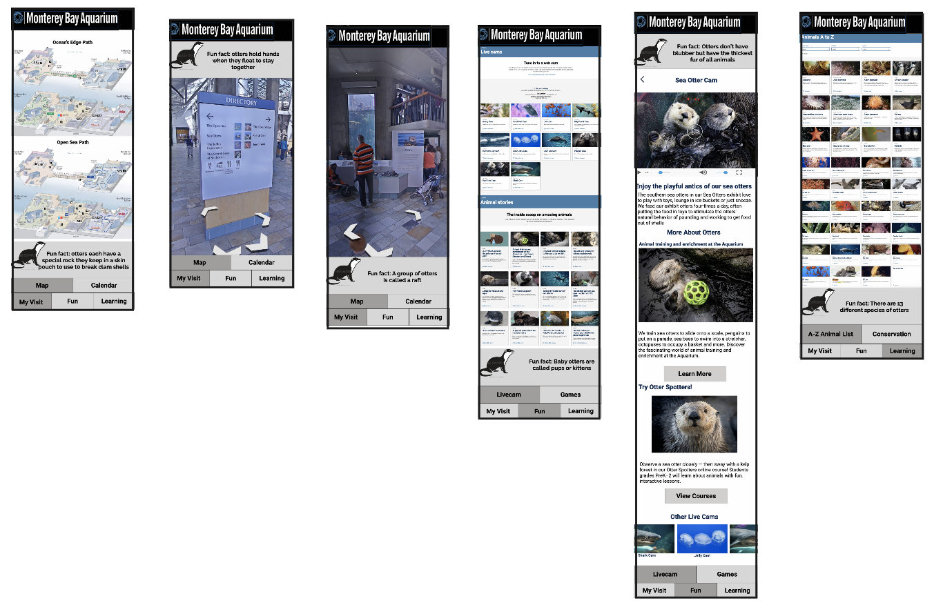
We decided to divide the app into 3 main categories- My Visit, Fun, and Learning. My visit comprised of the map and the calendar. Fun comprised of the livecam and games. Learning comprised of an A-Z list of animals and information on conservatin
We designed those main categories pages for the main tab and then came back together to collaborate on a homepage and onboarding. I was in charge of the my visit page and in combining them to look cohesive.
Information Architecture
At this stage we also performed a tree test to determine how intuitive our categorizations were. We found that the task users had the most difficulty navigating successfully was adding an activity to the schedule. The results of the question on the schedule is shown below
Usability Testing
We then performed usability tests on our clickable prototype.
Style Guide
We determined a style guide together for how we wanted the app to look, picking colors and fonts to match the website
High Fi Prototype
After discussing and determining all of this we were ready to transform our low fidelity prototype into a high fidelity prototype. For this the team member who did not get to work on the low fi prototype made it with consultation from us on design decisions.
Preliminary Sketch Tablet version
While the Hi fi version was being created, the rest of us decided to discuss the tablet version a bit. We realized that my initial sketch was very well suited for a tablet version of the app but with a few small adjustments. We ended up just having me convert my original designs into the same format as our low fi prototype and into tablet but discussed next steps for how to best to turn it into a tablet version.
Next steps
As we wrapped up the 2 week sprint we found ourselves happy with what we came up with, but yet knowing there was more we could do.
Tablet format creation and testing
Development of gamification and rewards as well as the fun facts feature
Improve functionality and interaction of 2D Map and expand 3D map view
add more interactivity to the live cam
Further information architecture improvements and testing
expand educational offerings and courses


